Which colours could influence 2023’s cabins?

In what has become an annual tradition at Mankiewicz, a paint manufacturer that develops products for spaces including aircraft interiors, its in-house design department has looked at social trends and influences and tried to translate them into three colour shades. For 2023, the team has felt that serious events in the world are constantly negating people’s feelings of being carefree or lighthearted.
“We live in times that are calling many things into question, giving us pause and exasperation. In recent years, ‘resilience’ has haunted the ranking of most frequently used words, and it will probably remain there for some time,” said a member of the team. “Society has the belief that it will face a challenging future.”
Clearly the team has a slightly gloomy outlook, but that is not reflected in their proposed 2023 palette. Indeed, the team feels that many people, as a counterweight to their negative feelings, will lean towards a sense of escapism and colours that help make them feel good. For example, they cite a trend for contemporary product and interior design to feature fantasy creatures and subtle shimmers of colour on surfaces, with an interplay of light and gradients of colour that provides a subtle hint of what they call ‘wonderland’. The colours of nature are also popular, with greenery, sandy and earthy shades delivering a durable and soothing effect.
The Mankiewicz team has translated this trend with their Colours of the Year, which have a noticeable feel-good factor. They have chosen colours that are strong yet gentle and quiet, which offer good scope for design and creativity. “It is not about loud colour accents and making bold statements this year,” said the team.
The key colours for 2023
The theory is all very well, but what are the actual colours that public sentiment can be translated into?
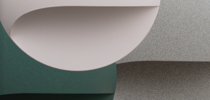
The first is named La Fée-Dragée – French for the Sugar Plum Fairy, star of the Nutcracker by Tchaikovsky. The colour shade is similar to the fairy’s pink ballet tutu. The colour can feel mild, soft and, in certain contexts, rather escapist.
“We associate it with flower petals, soap bubbles and the sky at dawn. In surface design, this colour effects a sleek contrast or offset for any surface, interior or product. Not being overly sweet, context and design language can also bring out its serious side, so that it also functions as a ritzy, fresh team player,” explain the Mankiewicz team.
The second colour is Oyster Mushroom, a neutral, slightly greyish shade of brown can be found in tree bark, animal furs and the shells of snails. Undyed wool and rough textiles were a key inspiration, with a slightly irregular hue and surface, complemented by an elegant multicolour effect that exudes softness and closeness to nature. This neutral colour is suited for use in many contexts, such as an aircraft cabin.
Finally, green is a hue associated with nature, growth and health. The Under Leaves colour is intended to immerse one in a colourful oasis of escape: When surrounded by plant life and with only diffused light falling through the foliage, the light can appear slightly bluish. Such light can create a feeling of depth and tranquility and inspire enchantment – whether one is above or below water. Green is a shade that currently appears with many nuances in most types of product. From mild, greyish sage to deep petrol tones, green is a colour that needs to be combined wisely. But, as the Mankiewicz designers say, green can be applied to show strength of character.